Designing a Local Skill Bartering Experience - SkillSynq
My Role
UI/UX Designer
Design Skills
Design Thinking | Usability testing | UI design
Background of the app
SkillSynq is a localized skill-bartering app that allows users to exchange skills and services without money. Users offer their expertise and trade it for skills they want, supported by verified profiles and ratings. The platform promotes community-driven learning and mutual support through a trust-based barter system.
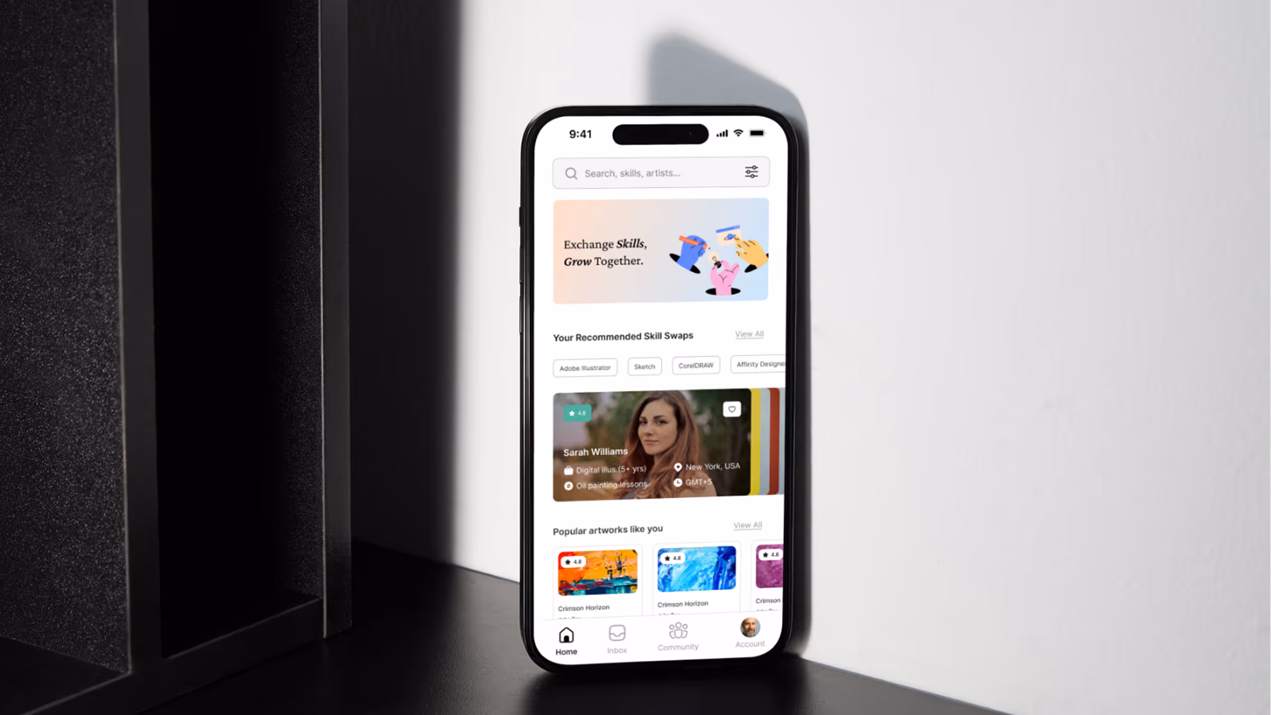
Overview of the app
Step 1: Discover a Match
- Action: User browses the Home Screen using Filter Tabs (e.g., "Adobe Illustrator") to find mentors.
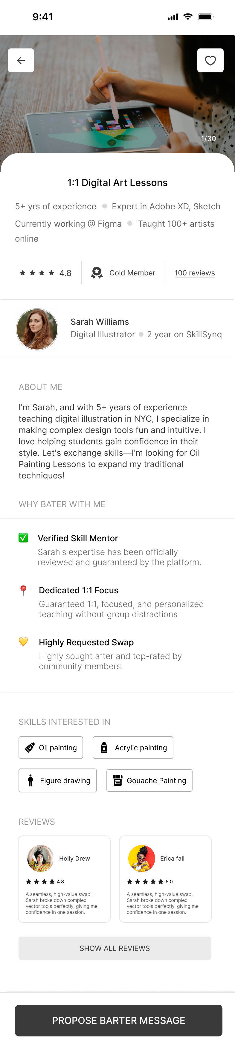
- Outcome: The user finds a compatible profile (like Sarah Williams) whose Skill Offered (Digital Illustration) matches their need and whose Skill Sought (Oil Painting) matches their skill, based on visible Trust Signals (4.8 Rating, 5+ yrs).
Step 2: Propose the Barter
- Action: The user (Ross Byers) taps the sticky "PROPOSE BARTER MESSAGE" CTA, which opens the Proposal Form.
- Outcome: The user submits their specific Offer (their skill) and a message, initiating a formal "PROPOSE SKILL SWAP" request that is sent to the mentor for review.
Step 3: Activate the Connection
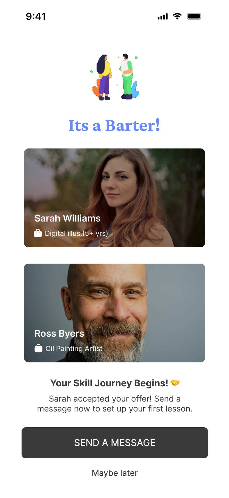
- Action: The mentor (Sarah) accepts the proposal, triggering the Match Confirmation Screen.
- Outcome: The app celebrates the "IT'S A MATCH!" and the user taps "SEND A MESSAGE" to instantly enter the chat and schedule their reciprocal skill exchange
Flow of the app
Design decisions
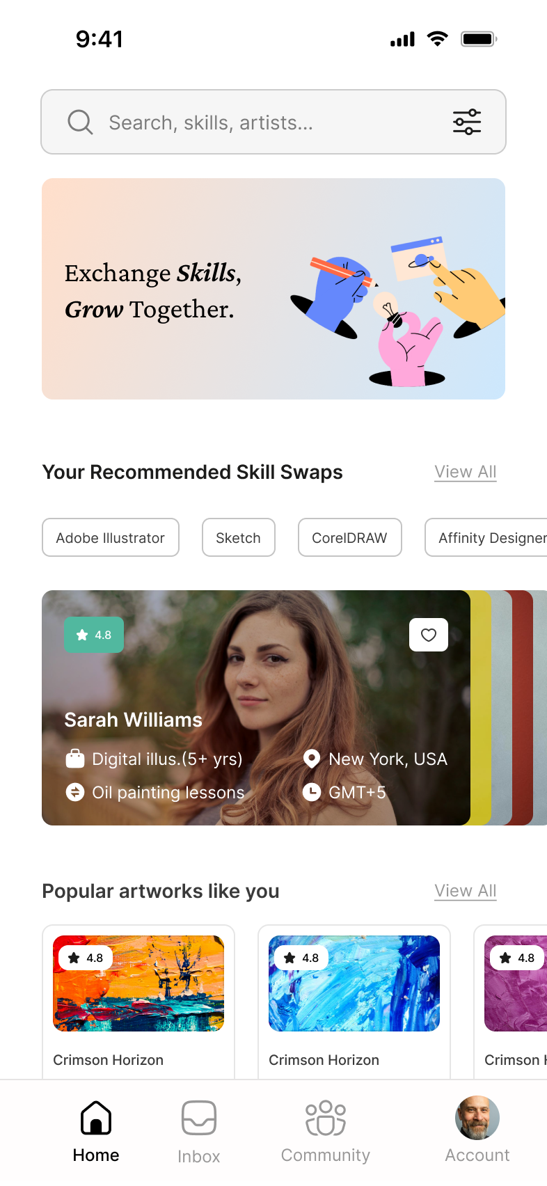
Screen 1: Home Screen
- Front-Loaded Information (Home Screen): The profile card is rich with actionable data. Crucially, the card displays both the skill offered ("Digital illus. (5+ yrs)") and the skill sought ("Oil painting lessons"). This is the single most important usability decision, allowing users to rapidly find compatible swap partners without clicking into the profile. which also acts as a trust building factor
- The tabs (like "Adobe Illustrator," "Sketch," "CorelDRAW" in your design) serve as a detailed filter icon. By presenting a curated, small set of categories, the app guides the user's focus. The user doesn't have to guess the correct search term; they just tap the relevant tabs.
Screen 2: Profile of the barter
- Credibility Badges: Key trust signals are visually prominent near the name and rating. The 4.8 Star Rating and the Gold Member badge provide immediate social proof and authority.
- Adapted Trust Signals: The "WHY BATER WITH ME" section directly mimics successful marketplace patterns (like the Airbnb Superhost list). Features like "Verified Skill Mentor" and "Dedicated 1:1 Focus" provide guaranteed quality and service expectations, mitigating the risk inherent in a peer-to-peer exchange.
- Social Proof : The REVIEWS section uses high-rated, personalized snippets, reinforcing the positive experiences of past users and confirming Sarah's reputation.
Screen 2: Barter confirmation
- Clear Next Step: The primary focus shifts immediately to the next action: negotiation. The subheading "Send a message now to set up your first lesson" provides clear instruction.
- Clear CTA: The "SEND A MESSAGE" button is large, dark, and sticky, making it the highest priority interactive element on the screen. This design minimizes friction and ensures the user converts the accepted match into an active conversation immediately, preventing user drop-off.
- Exit Option: Including "Maybe later" as a secondary link provides a low-pressure way for the user to acknowledge the match without being forced into the chat immediately, maintaining a good user experience.